Sunday, 1 April 2012

3 Final Art

A Walk In he Dark

I. Artwork Title- A Walk In The Dark

II.Reference Artist: Edward Much

III.Art Movement: Expressionism

IV. Theme Chosen: Culture & Society

V.Description: Depression affects the way I feel and perceive everything around me. The artwork is relatively simple; because it is a portrait of my own distorted reality like a painting that is devoid of colors. Life feels like a walk through a winding and singular path through darkness for me.


The Dead Tree


I. Artwork Title-The Dead Tree

II.Reference Artist: Edward Much

III.Art Movement: Expressionism

IV.Conceptualization: Depression makes me feel isolation because I feel like I want to shut off myself from the outside world sometimes. I used the imagery of a dead tree to show that it is something that is dead on the outside, and also on the inside. The random splotches of white represents my perception of the world, which is limited.

Bridge To Nowhere


I. Artwork Title-Bridge To Nowhere

II.Reference Artist: Edward Much

III.Art Movement: Expressionism

IV.Conceptualization: This art represents my efforts to move away from past traumatic events. It is a hard process, as if I need to cross mountains. But depression is like a broken bridge; it keeps hindering my progress and distorting my surroundings.


Saturday, 31 March 2012

Art Analysis: A Walk In The Dark

What is it about: 'A Walk In The Dark' was inspired by my constant feelings of depression and anxiety. here was a time where these two feelings were so strong in me before, that life ceased to become colorful for me.

Why did I choose it: The art was actually the one which I felt I had the most emotional attachment too. The concept came to me as an instinct, and not other picture describes what I feel as well as this.


Elements of Design

Lines- No lines are used because of he abstract nature of the art.

Shapes- The shapes being used in the art are organic in nature

Value- Contrast between the white color of the path and the blackness of the surroundings which represents life and depression respectively.

Colors- Black and white only

Texture- Rough

Propotion- Black and white mix together well within the picture.

Movement- No movement


Principles of Design

Hierarchy- More importance is given to the overall blackness of he picture in order to show the severity of depression on oneself.

Visual Balance- There is only some balance as can be seen in the current and opposite path.

Proximity- Black and White

Rhythm & Repetition- No rhythm or repeition

Scale- the figure on he path is purposely small to show inferiority and a sense of loneliness in comparison to the surroundings.  

Unity- Colors (Black & White), abstract shapes and proportion play a very big role in my art.

 Higher priority is given to the blackness of the picture to emphasize upon the theme of severe depression and the figure is scaled down in comparison o he overall picure

Wednesday, 29 February 2012

Expressionism Art


 Theme: (Society and Culture) Depression and Anxiety

Problem Statement:  severe Depression and Anxiety affects the mentality of an individual. Pent up emotions and stress causes suffering. If these emotions are not dealt with properly, it could influence one's life negatively.

Purpose of Content: To explore the themes of Severe Depression and Anxiety, and to act as a channel in order to vent my pent up emotions.

Research Question: How can expressionism help someone who is experiencing psychological disorders and can it be represented through art?


I choose to do expressionism art because it is an art movement which allows the artist to show express themselves to others via their art. The main reason why I choose to do this art movement is due to my experiences with severe depression and anxiety.


 The Confusing maze

This sketch represent my confusion. There are many paths and many entrances, but only one true exit. The maze gets progressively confusing the deeper I go, meaning that confusion is often something which I feel greatly, yet cannot shake off so easily.


 The Endless maze

Often times I will feel a deep sense of anxiety. The maze represents my mind when I feel anxiety; Closed off to the outside world. The hole in the ground actually represents the exit that I must take to escape. But I'm always too busy running endlessly around the maze, to bother looking for an alternate exit route.


A Walk In The Dark

This sketch represents the feeling of isolation I feel sometimes when I am burdened. It is just only me walking along a long and twisted road surrounded by a dark void around me. There is no where to go but take the long path forward


Downwards Spiral

The imagery of a spiral comes to mind when I am confused sometimes. I imagine standing inside the core of a giant spiral, and it is a long and winding road for me until I reach the end as I feel that I am walking around in circles


The Lifeless Husk


The dead tree in the picture represents a 'dead husk' which I look like on the outside, and the person inside represents me. Both me and the tree look 'dead' in the sketch. When I feel sad, people often remark that I look dead to the world.


Kind Isolation

I've often dreamt of times where I never felt like interacting with other people or seeing familliar sights. I only wish to be surrounded by mountains and sitting alone in the darkness. 

Veil of Darkness

The sketch is divided into four portions until it resembles a window. The window is colored with different shades of black/grey.


The Anger

A blood red hole in the center of the sketch represents my anger. Within the hole, is a tiny version of the sketch. The whole sketch is black save for the hole which is red in color .


The easy way Out

The sketch is essentially how one can live their lives: The dark cliff indicates the easy way, and the rope indicates the hard way. It shows just how negativity can affect out judgement.


Perception of Life

This sketch is based on the question 'Is the life half full or half empty'. For me, it is neither, because water continuously pours out until there is nothing left. I t represents how I can literally feel my life slipping away completely sometimes.


Man In The Mirror

A man is depicted in a hall of mirrors in this sketch. Despite him being surrounded by mirrors, there is no reflection of him. The mirror's act as a 'judge' of ones true image and actions.since there is no reflection, the man is in denial of his true self.


Monday, 23 January 2012

Principles of Design Analysis


Hierarchy-


Hirarchy, in terms of design is meant to perform 2 distinct functions, which are to organize content  and guide the viewer through the contents by their importance as shown in the diagram above.

The most important aspect of the art which is the figure is given the most attention by being put at the most front of the painting, while the rest are put in the background.


Visual Balance- Balance comes in two varieties, Symmetrical and Asymmetrical balance:

Symmetrical Balance
The above diagram illustrates an example of Symmetrical Balance:

 "Symmetrical balance is when the weight is equally distributed on both sides of the central axis."


Asymmetrical Balance
The above diagram is an example of Asymmetrical Balance: 


"Asymmetrical balance is when both sides of the central axis are not identical, yet appear to leave the same visual weight."


Symmetrical art is straightforward, and easy to make. However, it can easily make the art look uninteresting and monotonous to look at if overused. Asymmetrical art takes a bit more creativity to do, but it can create many variations in art, and makes art more interesting to look at.


Asymmetrical Balance is used prominently in the painting.There is an obvious different in size between the river in the background, the land and the bridge.


Proximity- Proximity in design is when common items are put together, and different items are put together separately in another group which is similar to them. Proximity ensures that the visuals/design are pleasing to the eyes and easy to look at.


Consider the Following example:

List with poor design


The above list looks cluttered and makes it hard to comprehend. Also, It is difficult to tell sub-headings from the details.


New Design Using principles of Proximity

When comparing the new list above to the older one, it is apparent that proximity makes it look more pleasing to the eye. Sub-headings are now made clear and there are spaces between sub-headings to help the reader differentiate the different categories. Also, Different fonts and word sizes are used to indicate different groups.

Different colors are used to differentiate elements in the painting from one another

Rhythm and Repetition-
Artwork by Andy Warhol on the prevalence of Mass Production on Society


The above artwork by Andy Warhol is an example of repetition used in art. The repetition of visuals makes the picture intriguing to look at, and makes it clear to society ponder about what Mass Production really is about.

When our eyes look at the painting, we can follow it from the first bottle to the last easily. The bottles in line with one another creates rhythm which makes it easy for the viewers to follow.

A bit of rhythm as  the people in the background are moving across the bridge


Scale-

The Face of Lincoln carved upon Mount Rushmore
The scale of an artwork has a significant influence on the impact of the art, and how do people perceive it.

The Face of Lincoln carved upon Mount Rushmore is at least 70ft. in height, and acts as a monument of his achievements in life.

The huge monument gives observers the impression that Lincoln did do great things when he was alive, but if it were just a miniature monument, then it wouldn't stand out just as much to the crowd.


The screaming figure looks small in comparison to his surroundings, which gives the viewer a sense of inferiority and dread.


Unity- Unity is the outcome of a successful artwork.It happens when all the principles of design complements each other perfectly. For Unity to occur in a painting, 3 criteria must be met:

  1. Each element of an artwork should not stand out independent of one another.
  2. People can comprehend the artwork.
  3. Artwork looks complete and wholesome to look at.

Conclusion: Abstract shapes and Colors play a huge role in 'The Scream' by Edward Much. Lines, Shapes, Value, Texture, Proportion, and Movement do not really play a big role.


The painting depicts good usage of  Hierarchy, Visual Balance, and scale to highlight the most important aspect of the painting, and the colors are used as an example of proximity to tell different elements from one another.


Sunday, 22 January 2012

Elements of Design Analysis

Why is it important to Analyze the Elements of Design?

According to ARTSEDGE, a program of the Education Department of 'The Kennedy Center' which specializes in educating its students about the Performing Arts:

"it is a strategy used to translate what you see into written words."


What are the Elements of Design?

Design consists of 7 elements which can be combined together to create art. The 7 elements are:

Line- The the most basic building block of design. Lines can be used to create complex shapes or to lead your eye from one area in the composition to another.

The whole painting consists mostly of abstract shapes rather than lines.

Shapes are created when lines are combined.Examples of shapes are a square, triangle, or circle. Shapes can be organic (irregular shapes found in nature) or geometric (shapes with strong lines and angles such as circles, triangles, and squares).

Organic shapes are dominant in expressionism art. 
Value- The degree of light and darkness in a design and also the contrast between black and white. Value can be used with other colors aside from black and white. Contrast is the extreme changes between values. 

Contrast between the sky, roads and stream in the background

Color-Functions by differentiating lines, shapes, forms, and space in art. Even black and white images have different shades of the color gray.


Texture- The surface quality that can be seen and felt. Textures can be rough or smooth, soft or hard. Textures are often implied in drawings. For instance, a drawing of a rock might appear to have a rough and hard surface, but in reality is as smooth as the paper on which it is drawn.


Proportion- What is created when the sizes of elements in a work of art are combined harmonious. Consider the Following Diagram from Bluemoonwebdesigns.com 


Proportion plays a huge role in 'The Scream'. The agonized figure depicted screaming looks like the closest thing to the viewer in comparison to the background.


Movement- is the path our eyes follow when we look at a work of art. The purpose of movement is to create unity in the artwork with eye travel. Repetition, rhythm and action are used to give this characteristic to art:


How Repetition & Rythm creates movement in art


Implied action in art which gives a sense of movement
The two figures in the background moving across the bridge.
 

Saturday, 21 January 2012

About Edward Much

Expressionism originated at the beginning of the 20th Century as a way for artists to express themselves.

One of the most influential artist in the Expressionism scene is Edward Much.

The reasons why I choose Edvard Much is because of his influence in the artistic field and also because of the popularity of one of his works amongst the general populace.

The following information are paraphrased and summarized from wikipedia :


EDWARD MUCH


Edvard Munch was born in the village of Ådalsbruk in Løten, Norway in 12th December, 1863.Edward moved to Oslo (Once known as 'Christiania') in 1864 when his father, Christian Munch was appointed medical officer at Akershus Fortress. Edvard's mother and elder sister both passed away due to Tuberculosis.

After the passing of his mother and elder sister, his father brought up Edvard and the rest of his siblings alone.

The strict upbringing  of his over-religious father, the passing of his mother & sister, as well as Edward's exposure to vivid ghost stories being told by his father to entertain him was the true base of most of his works.

Edward's Expressionism artworks  mostly explore the themes of his life which centers around love, fear, death, melancholia, and anxiety.


Expressionism Art


The art movement which I've chosen to focus on, is Expressionism.

The technique involved in Expressionism is is often not depicted in the form of physical reality, but rather in very subjective depictions, often invoking emotion and expressing a certain meaning. According to Wikipedia, Expressionism is the direct opposite of impressionism; where impressionism seeks to depict physical reality in a way which commands the viewer's attention, expressionism is how the artist express meanings and emotions to the viewer through his/her own style.

It is often theorized that Expressionism was started as a reaction to the art styles of positivism, naturalism, and impressionism.  

 
One of the most famous and well-known Expressionism art is as pictured below:

Edward Much, The Scream (1893)


The meaning behind the portrait, is that the artist, Edward Munch, expresses a sense of angst and as wikipedia puts it:

"The environment of The Scream is often compared to that which an individual suffering from depersonalization disorder experiences, such a feeling of distortion of the environment and one's self"

Rolf Nesch "Elbe Bridge"
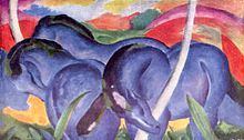
Franz Marc "The Large Blue Horses" (1911)                                                                      


The style of expressionism is rarely aesthetically pleasing, rather through using colors and abstract shapes which vaguely resembles something from reality, or does not at all.

 
Colors and dynamic abstractions are used to represent vivid emotional reactions.


Friday, 20 January 2012

Perceptual and Conceptual Art

Perceptual and Conceptual art.

Just what are they?

 According to wikipedia,  perceptual art is drawing which affects the viewer psychologically. To put it into simple terms, perceptual art engages the viewer in a multi-sensory  manner  through stimulation as he/she tries to interpret the meaning of the art to them. 

The meaning of the art varies from individual to individual, and because of this, it stimulates the mind and senses of the observer to figure out what the art means to them.

An example take the art style of  Optical art or also known as  'Op art'. The art below is an example:


Briget Riley, Movement in Squares (1961)

The opt art above creates a number of different impressions to viewers depending on the individual.


Personally, the image gives me the perception that the squares are turning very slowly. Another time however, the image makes me feel disoriented or as if I'm gazing into infinite space.


Therefore, perceptual art is perceived very differently among people, as it causes different sensory stimulation to different people and through subsequent observations.


Conceptual art on the other hand, are intended to make the observer think, as characterized by the Stanford Encyclopedia of Philosopy (SEP). Stimuli is almost immediate among individuals upon observing perceptual art, but individuals will need to ponder conceptual art to understand it's true meaning.


The following picture is an example of Conceptual Art:

Joseph Kosuth, One and Three Chairs (1965)

At a glance the above painting does not seem to convey any particular meaning other than just looking like a painting.

Many intepretations have been on the internet trying to describe the meaning of the picture. Here's one from wikipedia:

"A viewer may ask "what's real here?" and answer that "the definition is real"; Without a definition, one would never know what an actual chair is."


The above is only one of the few interpretations of this particular painting. So, we can say that conceptual art makes the observer to make sense of the picture, in their own words and ways.